Arc Dialog Example - All Controls
Arc Dialog Example - Using All Controls
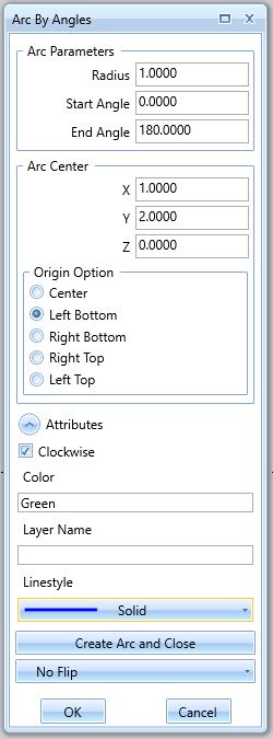
The following example was created to show usage of all controls available in the system for the UI creation.
Example
function ShowArcDialogBox ()
-- Controls for defining radius start and end
dataArcImg = { ControlID="ArcImg", ControlType="Image", ImageName="ArcParams.png", Stretch="None" }
dataRadius = { ControlID="Radius", ControlType="TextBox", Label="Radius", Value=1.0*25.4, ValueType="DoubleUnit" }
dataStartAngle = { ControlID="StartAngle", ControlType="TextBox", Label="Start Angle", Value=0.0, ValueType="DoubleNoUnit" }
dataEndAngle = { ControlID="EndAngle", ControlType="TextBox", Label="End Angle", Value=180.0, ValueType="DoubleNoUnit" }
dataArcGroup = { ControlType="GroupBox", Header="Arc Parameters", ListControls={dataRadius,dataStartAngle,dataEndAngle} }
-- Controls for defining the arc center
dataCenterX = { ControlID="CenterX", ControlType="TextBox", Label="X", Value=1.0*25.4, ValueType="DoubleUnit" }
dataCenterY = { ControlID="CenterY", ControlType="TextBox", Label="Y", Value=2.0*25.4, ValueType="DoubleUnit" }
dataCenterZ = { ControlID="CenterZ", ControlType="TextBox", Label="Z", Value=0.0*25.4, ValueType="DoubleUnit" }
dataCenterOption = {ControlID="CenterOption",
ControlType="RadioButtonGroup",
Header="Origin Option",
Option=2,
ListControls={"Center","Left Bottom","Right Bottom","Right Top","Left Top"} }
dataCenterGroup = { ControlType="GroupBox", Header="Arc Center", ListControls={dataCenterX,dataCenterY,dataCenterZ,dataCenterOption} }
-- Controls for the arc attributes
dataIsClockWise = {ControlID="IsClockwise" , ControlType="CheckBox", Text= "Clockwise", IsChecked=true }
dataColorLabel = {ControlType="Label", Text="Color" }
dataColor = {ControlID="Color", ControlType="TextBox_String", Value="Green" }
dataLayerLabel = {ControlType="Label", Text="Layer Name" }
dataLayer = {ControlID="Layer", ControlType="TextBox_String", Value="" }
dataLineStyleLabel = {ControlType="Label", Text="Linestyle" }
dataLineStyles = {ControlID= "LineStyle",
ControlType="ComboBox",
Option=2,
ListControls={{Text="None",ImageName=""},
{Text="Solid",ImageName="solid.png"},
{Text="Dash",ImageName="dash.png"},
{Text="DashDot",ImageName="dashdot.png"},
{Text="DashDotDot",ImageName="dashdotdot.png"}} }
-- Add all of the attribute controls to an expander
dataOtherParas = { ControlType="Expander", Header="Attributes",
ListControls={dataIsClockWise,dataColorLabel,dataColor,dataLayerLabel,dataLayer,dataLineStyleLabel,dataLineStyles},
IsExpanded=true}
dataButtonTest = { ControlID="Test Button Clicked", ControlType="Button", Text="Create Arc and Close" }
dataComboBox = { ControlID="FlipOption", ControlType="ComboBox", Option=1, ListControls={"No Flip", "Flip X", "Flip Y"} }
-- Define the window
windowParas = { Title="Arc By Angles", Width=250 }
-- Display the dialog box
retTable = Bcc.ShowDialogBox(windowParas, {dataArcGroup,dataCenterGroup,dataOtherParas,dataButtonTest,dataComboBox} )
return retTable;
end