The System Tab
Introduction
This topic will explain the System tab of the Settings dialog, will explain where to access it, will explain the options found in it, and will provide links to related topics.
The System Tab
The System Tab of the Settings dialog handles system settings like directories, CAM Tree flyouts, Data Collection
Navigation
To access the Settings dialog , do one of the following:
- In the Backstage,
click
 Settings.
 - In the CAM ribbon, click
 Settings.
 - In the Quick Access Toolbar, click
 .
.
By default the Settings dialog opens on the System tab.
The System Tab
General
Directories
Each item listed shows the file path in
which the files for each item are stored. Click in the text field to input
the file location manually, or click the ![]() button next
to each item to open the Browse for Folder dialog box. You can select
a new folder in which to store the files for the selected item. Generally
these should not be changed from the default directories.
button next
to each item to open the Browse for Folder dialog box. You can select
a new folder in which to store the files for the selected item. Generally
these should not be changed from the default directories.
- Data Folder - is the location for all of the BobCAD-CAM Data folders.
- CAM Features - is the location for storing the features that are saved in the CAM Tree.
Warning: Incorrect modification of these file paths can cause the system to malfunction. Do not alter these paths unless you fully understand how they work.
Backup
- Create backups - Backups are the previous save states or your files. Once a file is saved, a backup can be made the next time it is saved. The next time the file is saved, the previous save state will be saved as a backup.
 Select the check box to create and store backup files.
 Clear the check box to turn off file backups.
- Number of Backups - sets the maximum number of backup copies that are
created for each file.
Each time a file is saved, the previous backup is renumbered so that the most recent is Backup (1) , with the oldest being given the highest number.
- Number of Backups - sets the maximum number of backup copies that are
created for each file.
Each time a file is saved, the previous backup is renumbered so that the most recent is Backup (1) , with the oldest being given the highest number.
- Use Backup Directory
 Select this check box to store
the backup files in the location determined by the Backup directory option.
 Clear the check box to store the backup files in the
same location as the saved file.
Auto Save
- On
 Select the check box to turn on automatic file saving. Files are saved to their currently location with (AutoSaved) added to their name.
  Clear the check box to turn off automatic file saving.
- Save Interval (> = 15min.) - sets the period of time, in minutes, for how often the software automatically saves the file. For new files that haven't been saved, the software prompts you for the first Save As. The minimum allowable time is fifteen minutes.
- Save Interval (> = 15min.) - sets the period of time, in minutes, for how often the software automatically saves the file. For new files that haven't been saved, the software prompts you for the first Save As. The minimum allowable time is fifteen minutes.
Note: For files that have not yet been saved, the Auto Save feature will save them to your Temp folder with (AutoSaved) attached to the current name of the document. Keep in mind, new documents are always named BobCAD1, BobCAD2, BobCAD3... etc by default, this means these files could be overwritten frequently unless they are moved, or renamed.
Keyboard and Mouse
- Enter = Tab
 Select the check box to make the Enter key function
the same as the Tab key.
 Clear the check box to use the normal Enter key functioning.
 - Zoom to Cursor
 Locks the mouse on that point in the graphics area.
  The graphics area is zoomed in or out while keeping what is in the center of the graphics area centered.
 - Invert Scroll Wheel
 Pulling the scroll wheel towards you zooms in on the graphics area.
 Pulling the scroll wheel towards you zooms out of the graphics area.
3D Mouse
- On
 Select the check box to enable the use of a 3D mouse
within BobCAD-CAM.
 Clear the check box to turn off the use of a 3D mouse
within BobCAD-CAM.
Clear the check box to turn off the use of a 3D mouse
within BobCAD-CAM.- Rotation Center
This option is used to display a small sphere in the graphics area that represents the center of rotation that is used with the view rotation commands. With an empty graphics area, this displays at the WCS, but updates based on the geometry and viewing position of the graphics area.This can be set to one of the following:- Show Never
- turns off the display of the rotation center indicator.
- Show Always - always displays the rotation center indicator.
- Show On Motion - only displays the rotation center indicator when modifying the viewing position.
- Show Never
- turns off the display of the rotation center indicator.
- Rotation Center
Data Collection
- Help improve BobCAD-CAM by sending usage statistics - BobCAD-CAM collects usage statistics from the users to help understand what features of the software are being utilized the most and aid in deciding what improvements to focus on for future releases. See https://bobcad.com/privacy/software-usage/ for more information.
 Leave the check box selected so we can improve the features of the software you use the most.
 Clear the check box to not share your feature usage and hope that you like what we create based on what others use most.
Browser
- Use Online Help - determines whether the local, or online help system is launched when BobCAM for Rhino Help is launched.
 The online help will be launched.
 The local help will be launched.
 - Use Default Browser - determines whether default browser is used to launch the online help and setup sheets.
 The default browser is used.
 The Browser Application option appears allowing you to select the .exe of the preferred browser.
User Interface Options
User Interface
Theme
The Themes are what controls the appearance of the user interface. You can use these options to select between predefined combinations of graphical details, colors, and fonts.
Selection Mask
The selection masks can be used to control what entity types can be selected in the graphics area. When you enable selection mode, you can click an icon to disable the ability to select that entity type. This area will allow you to determine whether the selection mask options are shown in the graphics area, and if so, what area they are shown in.
- Show in the Graphics Area
 - The Selection Mask options are not shown in the graphics area.
 - The Selection Mask options are shown in the graphics area. With the Show in the Graphics Area check box selected, you can choose on which side of the graphics area it is shown. Choose between:
 - Left
- Right
- Bottom
Tree Behavior
-
Double-click - determines what double clicking an item in the CAD Tree, CAM Tree, or BobART Tree does. Choose between:
- Edit - launches the applicable dialog to allow you to adjust parameters in the wizard, edit geometry, set up tools, etc.
-
Expand/Collapse - allows you to expand and collapse items in the CAM Tree.
- Edit - launches the applicable dialog to allow you to adjust parameters in the wizard, edit geometry, set up tools, etc.
Contextual Toolbar
- Enabled
 - Associated options are only available through the main context menu, accessible through right-clicking the item.
 - Associated options can be accessed through the contextual toolbar by clicking on the item:
Operations Pane
-
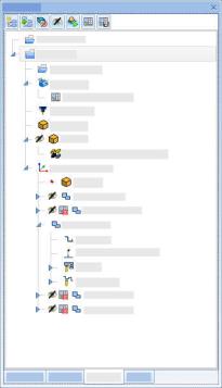
Look and Feel - determines how the Operation Tree and Tool Tree page toggles are show.
- Icons - each page option is shown with a single icon.
-
Icons and Text - each page option is shown with an icon, and the name of the associated page.
- Icons - each page option is shown with a single icon.
| Icons | Icons and Text |
|
|
|
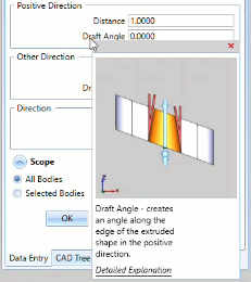
Contextual Help
- Enabled
 - The Contextual Help is not shown.
 - Hovering over an item with available contextual help will display its definition and provide a link to the associated help topic.:
CAM
CAM Tree
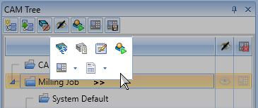
- Enable CAM Tree Flyouts - The CAM Tree Flyouts appear as the '>>' symbols next to items in the CAM Tree. These allow you to double check some, and even edit other values by simply clicking on them in the CAM Tree.
 Select the check box to show, and be able to utilize, the CAM Tree Flyouts.
 Clear the check box to hide the CAM Tree Flyouts.
 - Auto Blank New Items - Determines the Blank/Unblank state of newly created features and their operations. By default toolpath is shown until it is hidden by the user. Using this option will reverse that and the toolpath will be hidden until the user clicks an operation in the CAM Tree, or unblanks the toolpath.
 Select the check box to have the toolpath of newly created features hidden.
 Clear the check box to have the toolpath of newly created features shown.
Look and Feel
- Style - allows you to adjust whether the Blank/Unblank and Post Yes/No states are accessed through the context menu only (Classic), or whether they are shown in columns in the CAM Tree and used as toggles (Extended).
| Classic | Extended |

|
|
- Status Location - allows you to adjust whether the Blank/Unblank and Post Yes/No toggles are located on the left or right side of the CAM Tree.
| Left | Right |
|
|
|
Tip: See the Status Style States topic to get more information.
Posting
- Font - allows you to set the font used for the posted code in the Posting Manager.
Simulation
Simulation Window - Choose between:
- Embedded Window - launches the simulation inside the graphics area of the application. The size of the simulation can only be controlled by adjusting the size of the graphics area.
- Separate Window - launches the simulation as an independent window. The size and location of the simulation can be sized, minimized and maximized as any other application.
Operation Tree
- Display Feature Name - The Operation Tree shows all jobs and their operations to more easily organize the output. This option allows you to determine whether these operations should list only the name of the individual operations themselves, or whether the feature name should appear in front of the name.
 Select the check box to add "Feature Name : " before each operation name.
 Clear the check box to list only the operation name.
Customize Ribbon
The Customize Ribbon page allows you to:
- Modify the existing ribbon layout
- Add your own tabs
- Add your own groups
- Add commands to the groups
- Define the button size
- Define the button type
- Button - Click on the button to open a function.
- Drop Button - Click on the button to see several functions to choose from. Click the displayed function to open that function.
- Split Button - Offers a button and a drop down list. Click the main button to open that function, or click the arrow to see several other functions to choose from.
Note: The only ribbons that cannot be customized are the contextual CAM ribbons, which appear when the focus is placed on a job in the CAM Tree, and the document toolbars, which are the ones that offer functions inside the bounds of the graphics area. See the Customizing the Ribbons topic for examples.
| Choose commands from: | Customize the Ribbon | |
|
|
|
|
|
|
|
||
|
||
|
- Add >> - The highlighted command will be added to the selected Group of Button Group.
- << Remove - The highlighted item and its children will be removed.
- ^ - The highlighted command will be moved up the tree.
- v - The highlighted command will be moved down the tree.
Parameters
- Size - Choose between:
- Large - creates a large button.
- Medium - creates a medium button.
- Small - creates a small button.
- Large - creates a large button.
- Type - Choose between:
- Button - Creates a button which opens the function with a single click.
- Drop Button - Creates a button which opens a list of functions to choose from. Click on one of the choices to open that function.
- Split Button - Creates a button which is actually half button, and half drop down list. Click the main button to open that function, or click the arrow to see several other functions to choose from.
- Access Key - sets the access key to be used for the selected function. Access keys are keyboard-based shortcuts for what would normally be "mouse clicks" These provide a way to access the function without the need no move the mouse over the item and select it. You can turn on the access keys pressing either Alt+F, or Alt+Shift on your keyboard.
- Import - Allows you to import previously saved ribbons. When you click Import, a file open dialog will appear allowing you to select a .xml file. Locate the file and click OK, and the Customize the ribbon group will automatically update. It can then be modified further.
- Export - Allows you to export the current ribbon. When you click Export, a save as dialog will appear allowing you to name, and save the current ribbon as a .xml file. This can then be saved for use at a later time, or shared with other users.
- Reset - Allows you to load the default ribbon layout into the dialog. This will present you with a message informing you that this cannot be undone. Clicking OK will throw away any changes in progress and load the default ribbon layout.
Customize Shortcuts
The Customize Shortcuts page allows you to define ways to open commands using specific combinations of keyboard keys. For more information on the keyboard shortcuts, see the Keyboard Shortcuts topic.
Keyboard Shortcut Rules
When creating shortcuts, keep in mind there are valid key combinations, and key combinations that cannot be utilized.
-
Alt+Alphanumeric shortcuts are not allowed.
-
Shift+Alphanumeric shortcuts are not allowed.
-
Commands can have multiple shortcuts.
-
A shortcut key can only be assigned to a single command.
If a key combination is entered that has been previously assigned, the current assignment will be noted under the Add New Shortcut Key text field. If the shortcut is then assigned, the previous assignment will be removed.
| Shortcut Creation Rules | |||||
|---|---|---|---|---|---|
|
Valid |
|||||
| Function Keys only |
|
||||
| Alt + Function Keys |
|
||||
| Ctrl + Function Keys |
|
||||
| Alt + Alphanumeric Keys |
|
||||
| Ctrl + Alphanumeric Keys |
|
||||
| Ctrl + Shift + Single Key |
|
||||
| Ctrl + Alt + Single Key |
|
||||
| Alt + Shift + Single Key |
|
||||
| Ctrl + Shift + Alt + Single Key |
|
||||
| Shift + Alphanumeric Keys |
|
||||
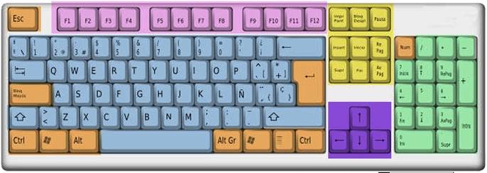
| Keyboard Areas | |||||

|
|||||
|
|
||||
|
|
||||
|
|
||||
- Commands - list group lists all possible commands to create keyboard shortcuts for.
Description
This group gives a brief description of the selected command.
Current Keys
This group will show a list of the current shortcuts assigned to the selected command.
- Remove - This will remove the currently selected shortcut key from the Current Keys list.
Note: While a single command can have several shortcuts, a particular shortcut can only be used for a single command.
Add New Shortcut Key
This group will allow you to add shortcut keys to the selected command.
Note: Only valid shortcuts will register in this list. See the shortcut creation rules chart above.
Warning: When a valid shortcut is entered, a message will appear below informing you what the shortcut is currently assigned to. If it is not listed as [Unassigned], clicking Assign will remove the shortcut from the command it is currently assigned to, and assign it to the currently selected command.
- Assign - This will add the specified shortcut to the Current Keys list of the selected command.
- Reset All... - This will eliminate any customization that has ever been applied to the shortcuts by the user, and set all keyboard shortcuts to their original default settings.
- Apply to Default / Document - Applies the currently visible settings to the other document type. When in the Document Default tab, this will apply the same settings to the Current Document. When in the Current Document tab, this will apply the same settings to the Document Default.
Note: Only one page at a time can be applied to the other document type with the "Apply to ..." button. This ensures that the user can see the settings that are being copied to the other document type.
- OK - Closes the dialog.
- Apply - Applies the current settings.
- Cancel - Cancels any changes that have not been applied and exits the dialog.


